SAMPLE 1: Taskrabbit
Tasker App Onboarding
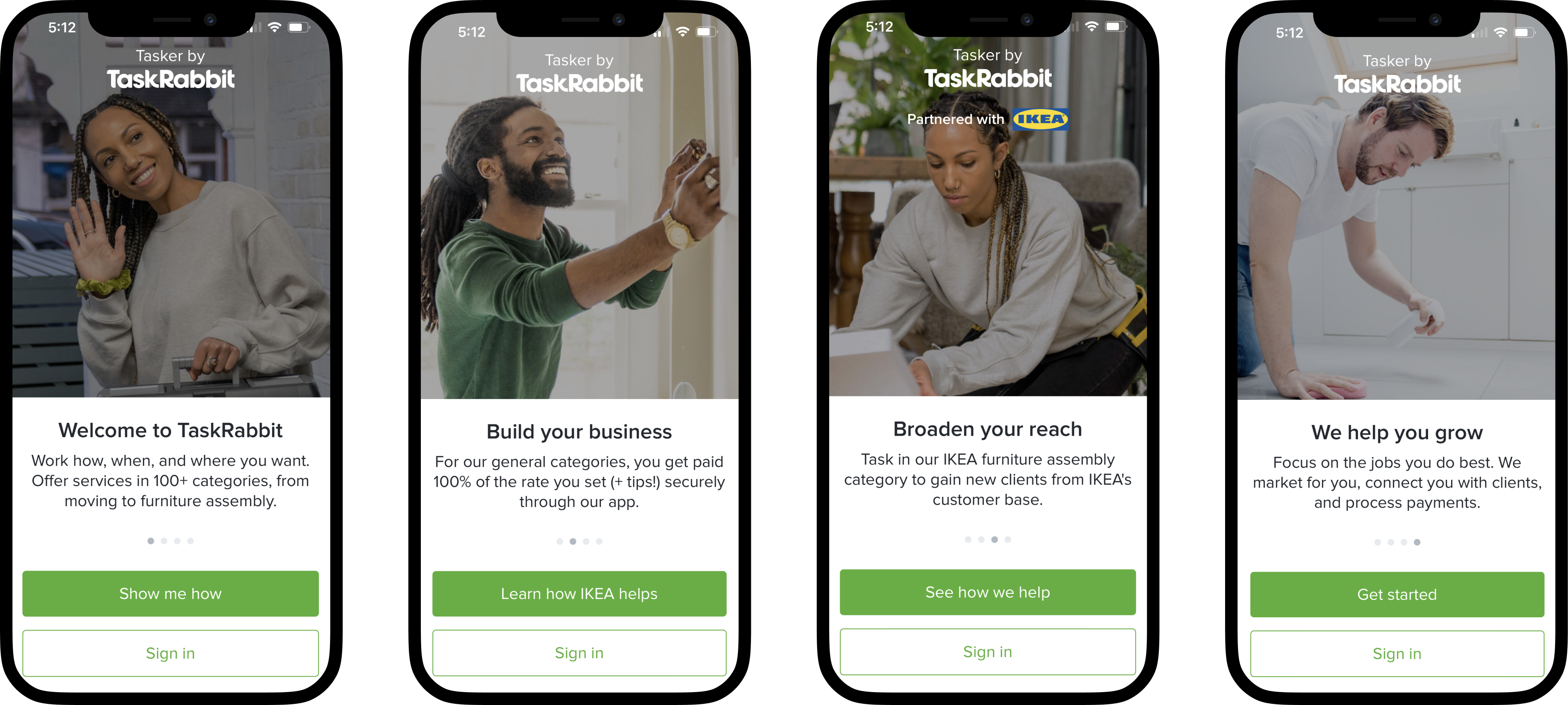
As a UX writer at Taskrabbit, Inc., I worked with the design team to rewrite, reorder, and reimagine the first four panels people see after downloading the Tasker app.
Together, the panels had to convey what Taskrabbit was, how people could use it to build a business, and how leveraging the company’s IKEA partnership could help.
I helped the team succinctly frame Taskrabbit’s value prop in a way that could be scaled globally for Taskrabbit’s eight countries, all of which have unique gig economies.
Elite Program Update
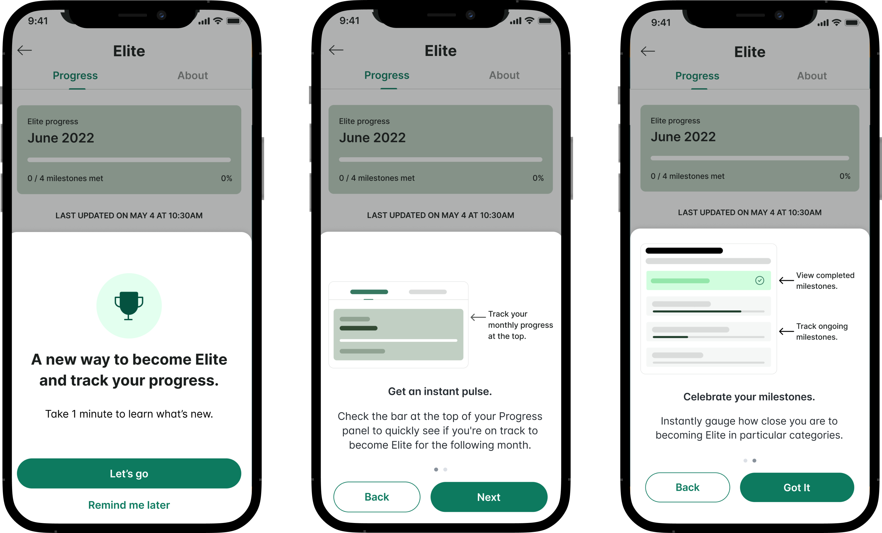
When Taskrabbit introduced a new set of business analytics for Taskers in 2022, their Elite program—which rewards Taskers for going above and beyond—had to reflect these adjustments.
This set of introductory panels had to generate excitement, explain how the change would impact Taskers’ businesses, and explain how to navigate the new and improved Elite dashboard.
I edited/rewrote these panels to more clearly sell the update’s value proposition for Taskers while giving them a clear idea of what to expect from this important change.
Tasker Analytics
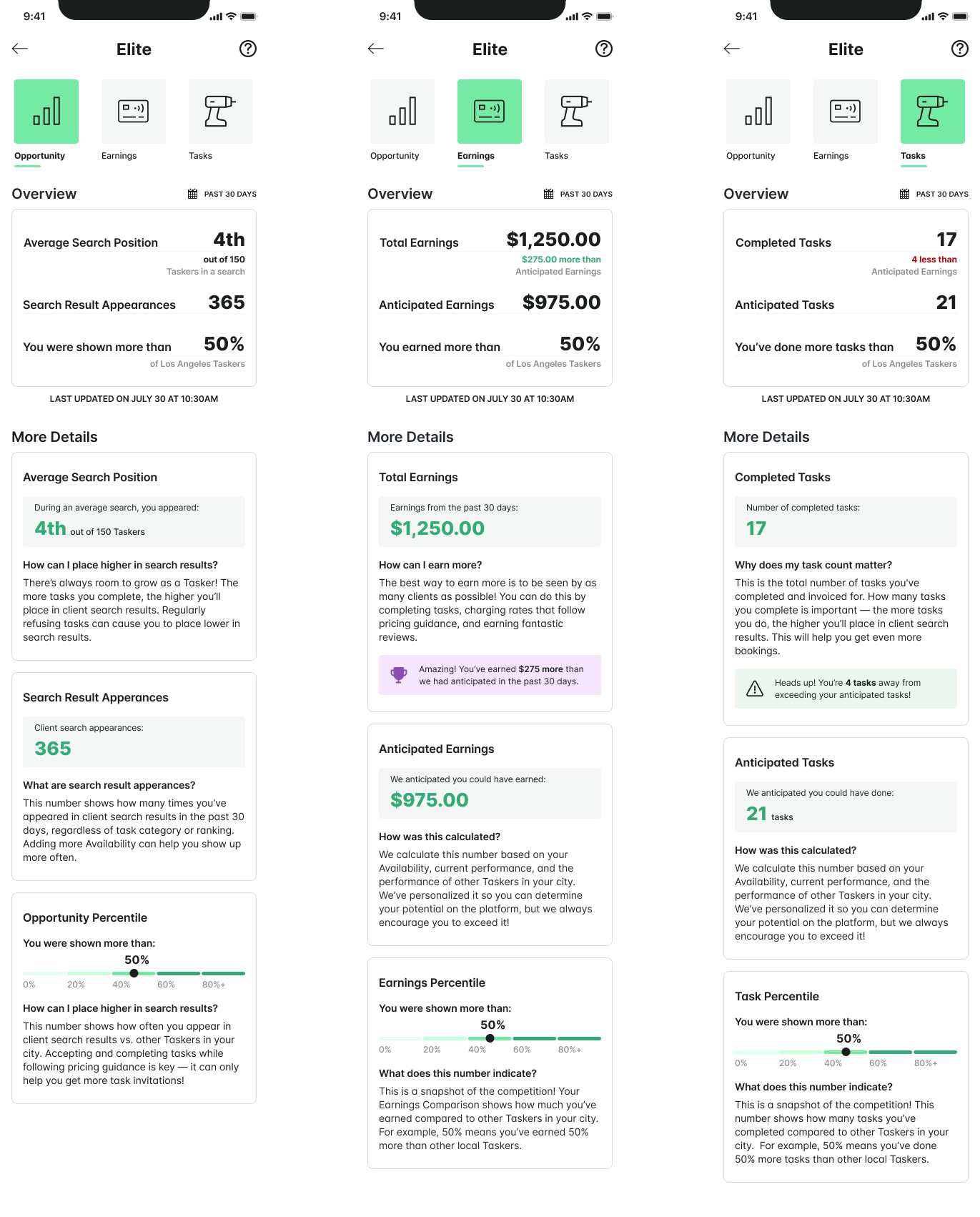
In 2022, Taskrabbit replaced its old Tasker Metrics with a new set of Tasker Analytics. The company designed these analytics to give Taskers more clarity about their businesses and encourage healthy competition.
The three dashboard panels below had to carefully explain how the app handled Taskers’ placement in client search results, how this affected their analytics, and how the app anticipated their potential.
I wrote/edited these panels while working cross functionally with the design, marketing, and legal teams to ensure we shared all the necessary information in easy-to-digest snippets while complying with all countries’ regulations.
SAMPLE 2: SPARKUP
Sparkup is an app proof of concept I designed and prototyped in Figma.
The app would connect disagreeing strangers for chat / debate.
Users would rate their chat partners—and themselves—to gain self-awareness metrics.
#1 – Onboarding
App onboarding is important in Sparkup—it’s not just account creation.
Once users signs in, the app has to engage them about their values and beliefs. This data is later used to for two things:
- Matching chat partners
- Generating self-awareness metrics.
Given the app’s purpose, language had to be casual and welcoming.
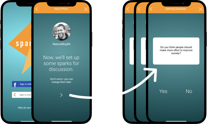
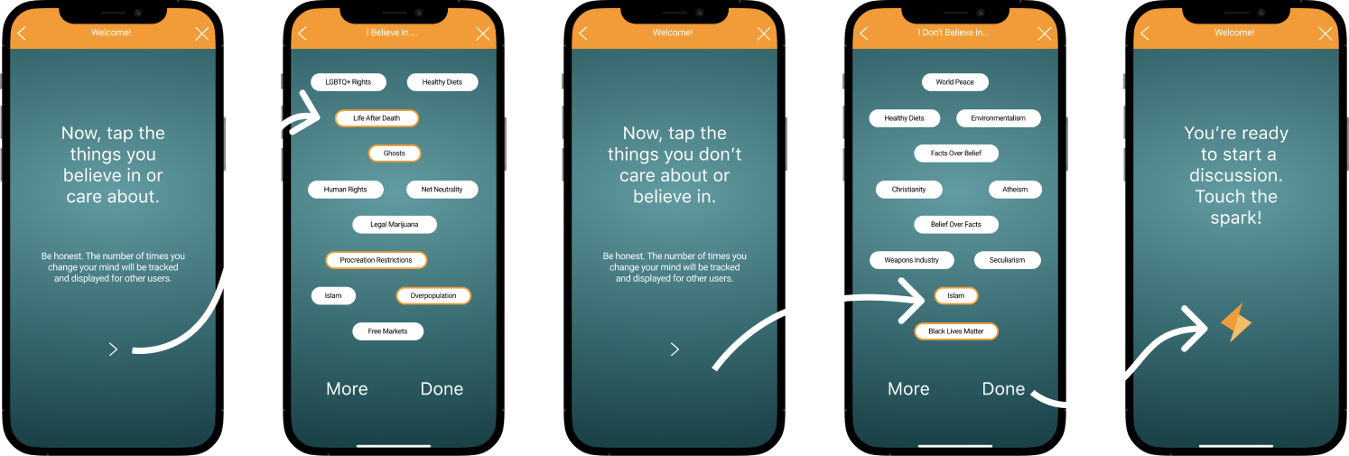
Step 1: After basic account creation, users are surveyed on 10 basic value statements. Answers are used later to keep them honest about their self-awareness metrics.
Step 2: After value statements, users pick and choose things they do believe in or care about.
Step 3: Finally, they choose what they don’t believe in or care about. Then they’re prompted to visit their dashboard and start chatting!
#2 – Chat/User Ratings
After chatting about a certain topic—and hopefully learning to empathize a bit—users rate their experience.
The app displays this data in the user’s “Ratings” section. These ratings help users compare how they view themselves vs. how others view them.
To guide the experience without friction, I wanted language again to be casual and straightforward.
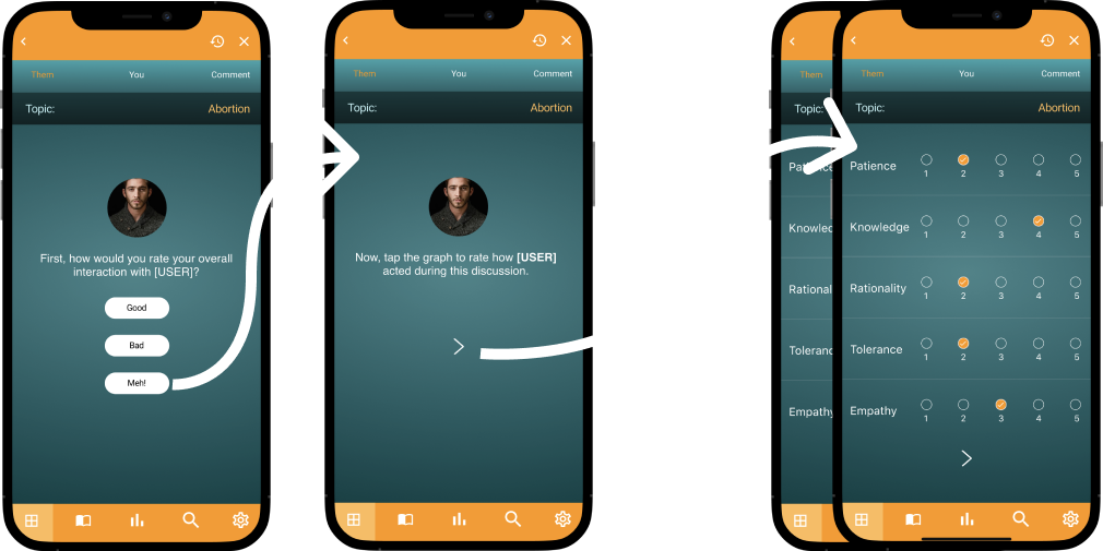
Step 1: First, users rate their partner in a number of areas.
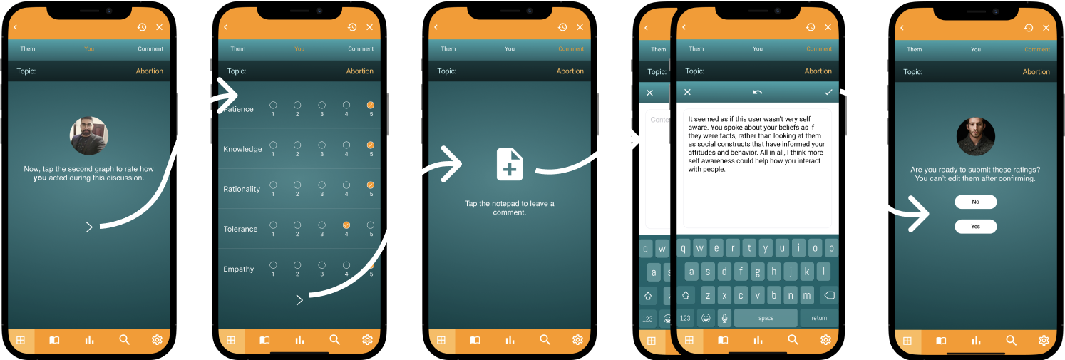
Step 2: Then they rate themselves.
Step 3: Finally, they can write an optional comment and submit the ratings.
#3 – User Stories
Users can passively participate in Sparkup by reading personal stories from others about certain topics.
They can also share their own stories for others to read.
This feature encourages users to share their experiences in a safe space while letting other users empathize with them.
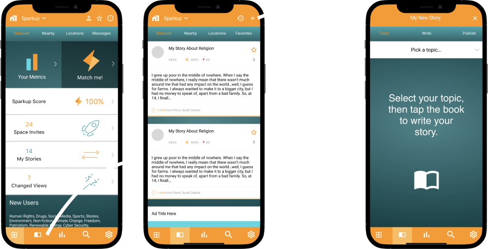
Step 1: Users can access the “Stories” panel from their main dashboard navigation. They can then click the “+” to add a story. I wanted the language to gently complement the inviting book icon so users feel comfortable sharing.
Step 2: After selecting a topic, users can write their story.
Step 3: Once finished, the app prompts users to “Publish.” I chose this word instead of “Post,” because it connotes a sense that the story is about to seen by a wide audience.
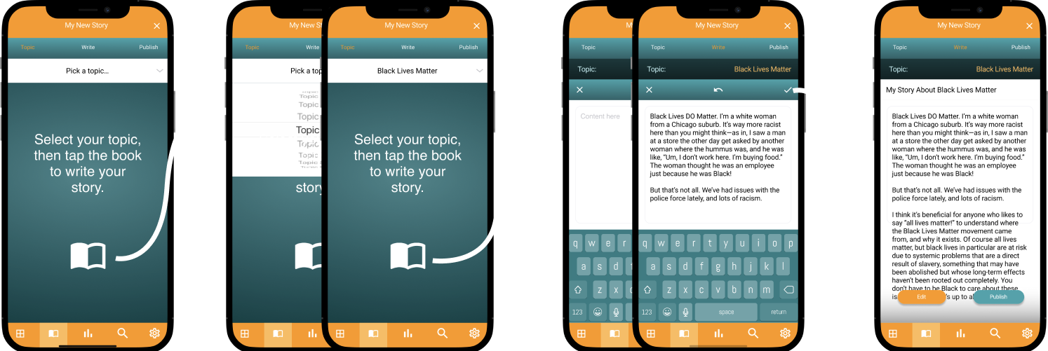
Error Messages: At any point in the story-writing process, a user might get an error message, depending on what action they select.

SAMPLE 3: FREEDA, INC.
#1 Homepage
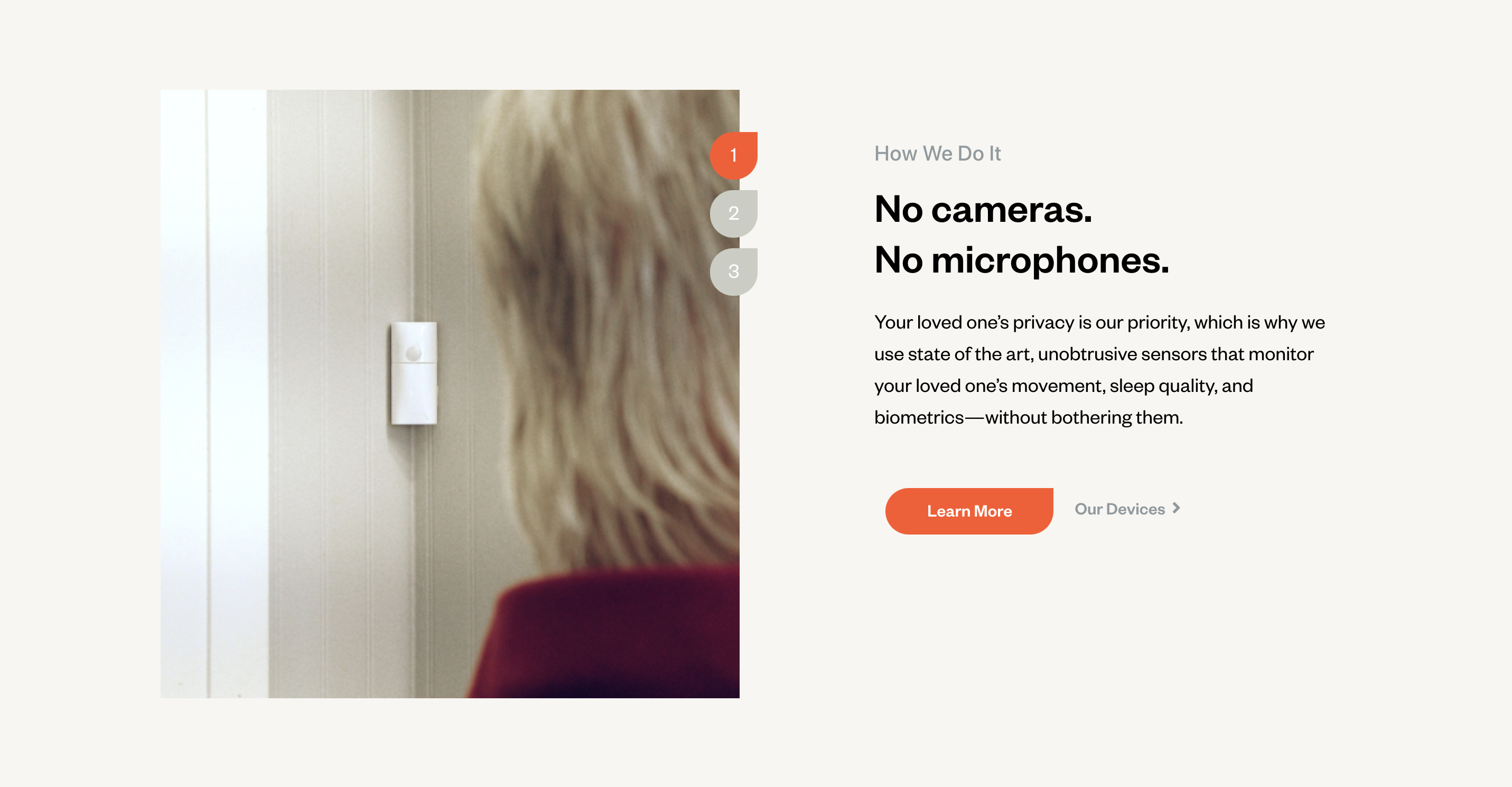
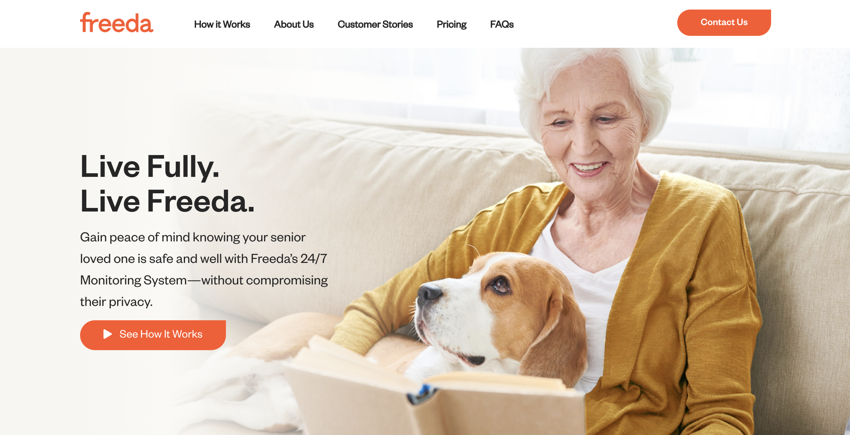
Freeda, Inc. was a San Francisco startup I wrote website and video copy for in 2021.
Check out these samples to get a preview of what the final copy looked like, starting with the homepage.
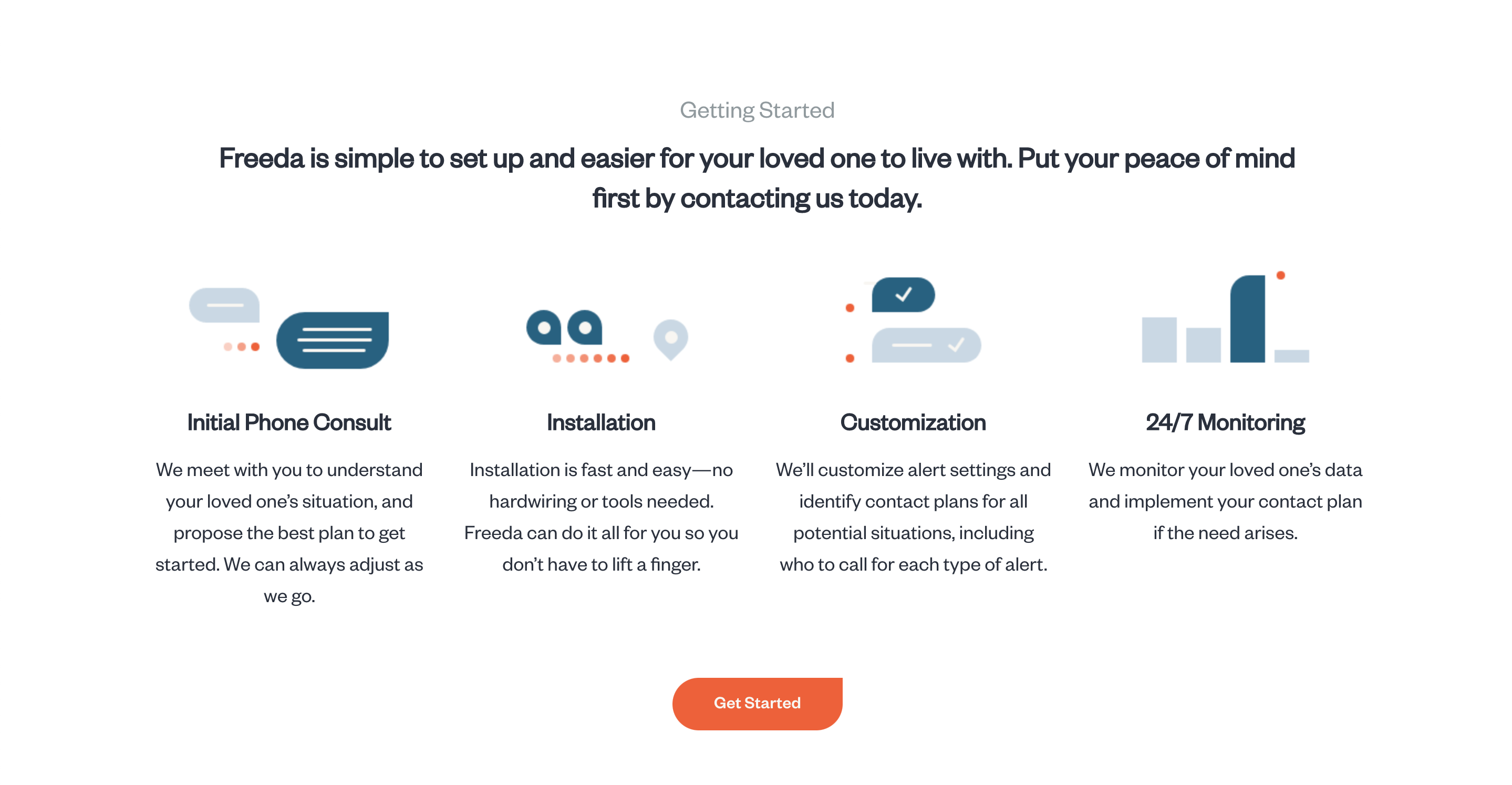
#2 Multiple Versions
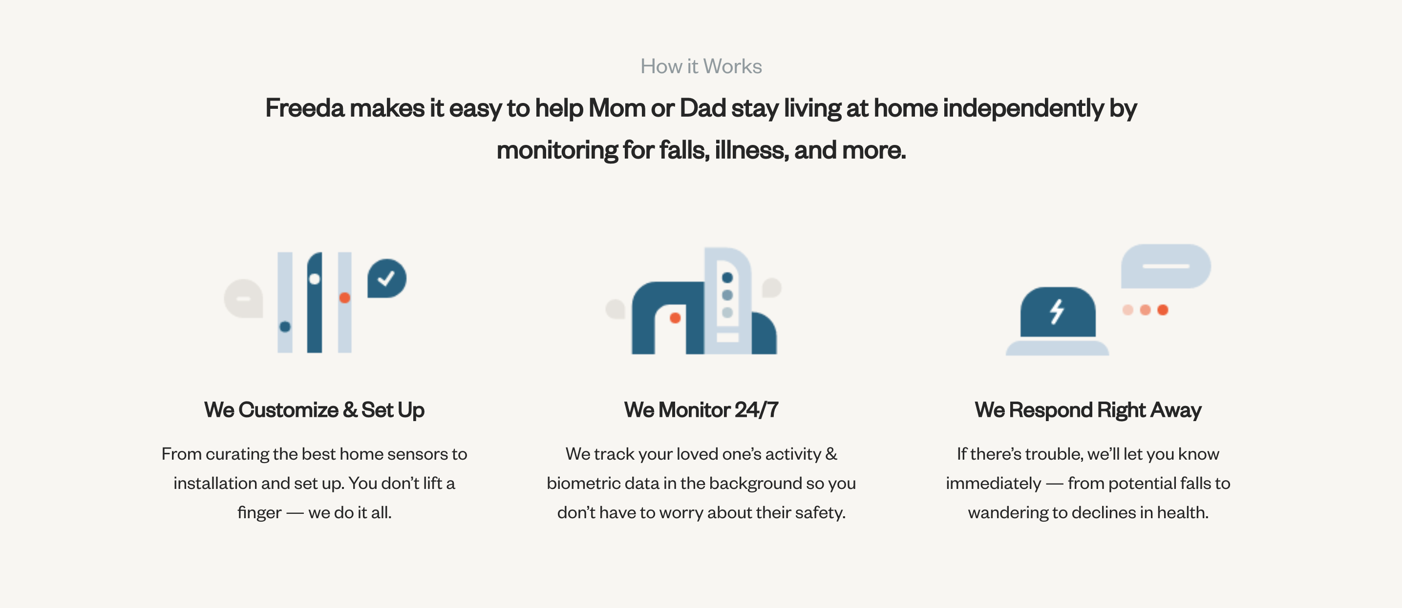
Across the site were different versions of how the business worked.
The content and language differed depending on what the page’s main content was.
#3 Explanation
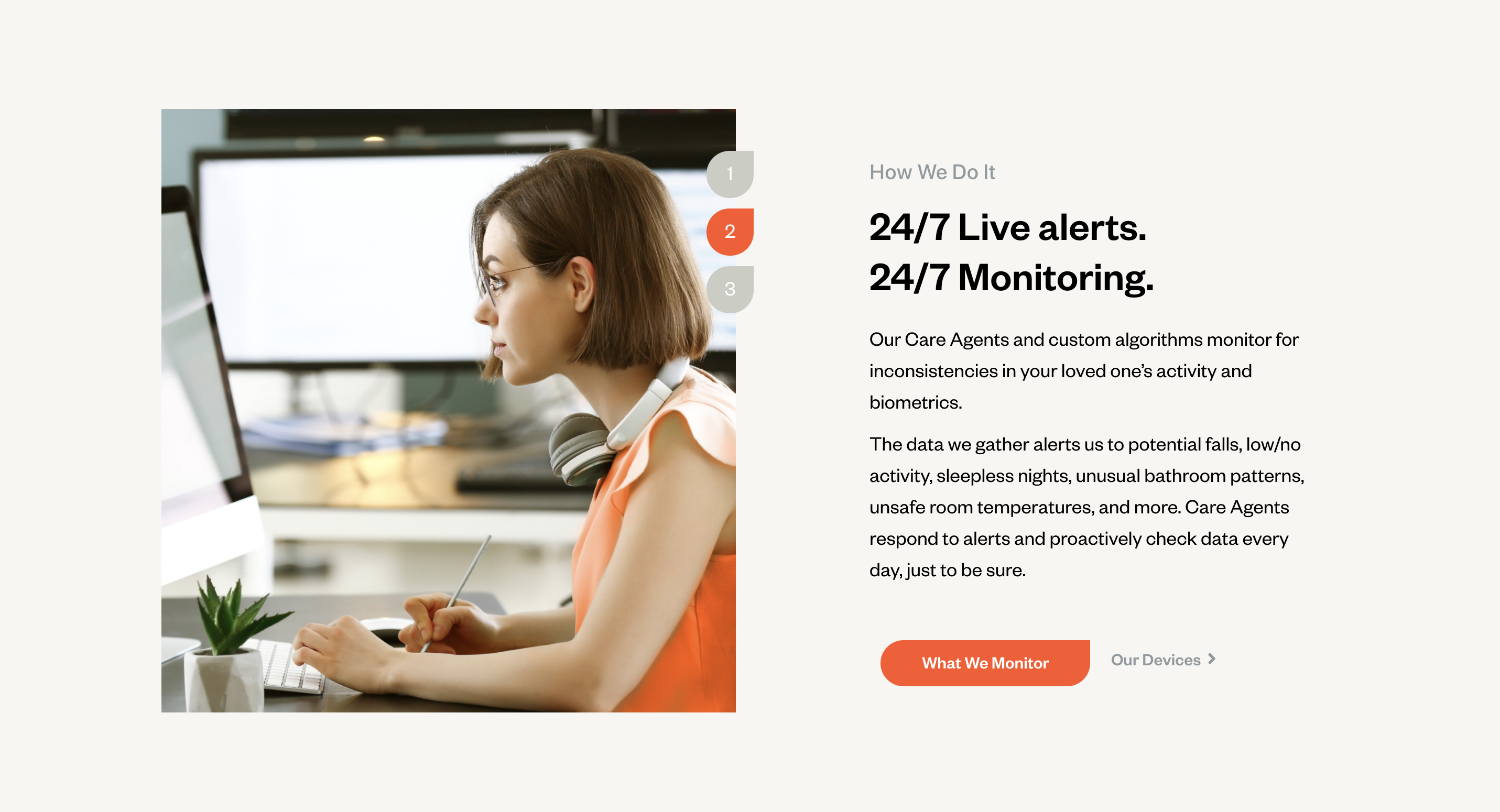
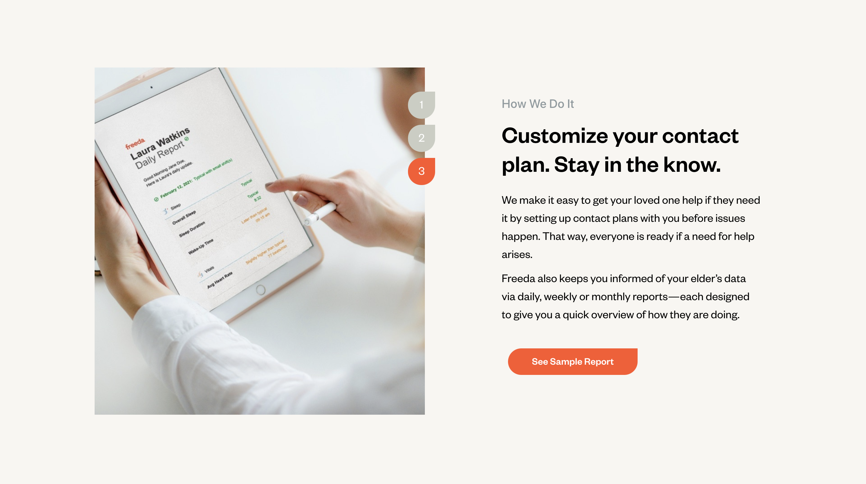
On a more detailed page, we dove deeper into the company’s approach to solving the problem it aimed to fix: that of safety for senior citizens.
We used multiple adjacent sections to tackle different aspects of the company’s services.
